Hello! Although it continues to be hot during the day, some cooler days tell us fall is coming. Fall is the season when sake brewing begins. The “Sake Talk” readers and Japanese sake lovers like you must be thinking about which sake you will enjoy when the newly brewed sake becomes available.
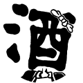
This article focuses on the history of the sake brand logos. In the Edo period (1603-1867) brand logos were called “shirushi” (literally meaning “marks”). Various brands of sake brewed in Kamigata (Kyoto and the surrounding vicinity where the Emperors resided) were sold in the towns of Edo (present-day Tokyo) through the Edo sake wholesalers.
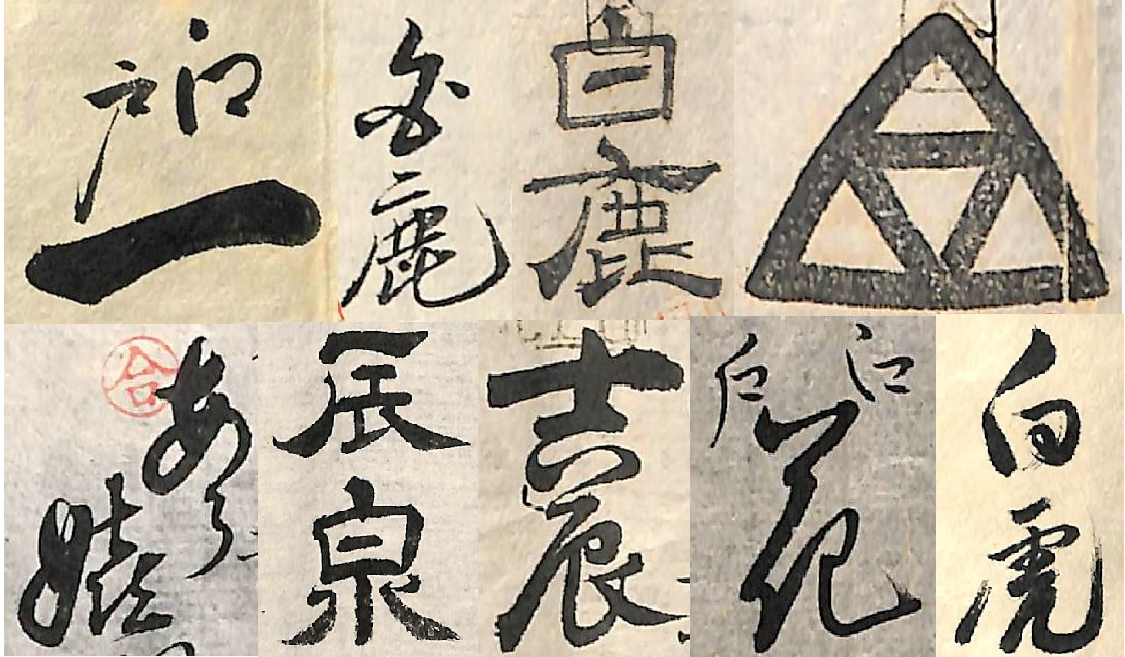
Top:Edoichi(Nakanoya Kōtarō)/Hakushika(Konishi Riemon)/Hakushika(Kashima Riemon)/Uroko(Kashima Riemon)
Bottom:Aa Ureshi(Takahashi Monbei)/Tatsuizumi(Takahashi Monbei)/Yoshitatsu(Konishi Sōbei)/Edobana(Matsuya Kanematsu)/Byakko(Izawa Kumajirō)
Above are the brand logos which were owned by a sake brewer in Nishinomiya named Tatsuya Kichizaemon. His main brand name was “Hakushika”. In the photo, you can see two different “Hakushika” logos. The main difference is in the design of the letters “haku”. These logos were made differently depending on the wholesalers. The cursive styled letter “haku” was for the wholesaler Konishi Riemon, whereas the other was for the wholesaler Kashimaya Riemon. The logo for the wholesaler Chiyokura Sōbei included the phrase “Aa Ureshi” (literally means “Oh, I’m so happy.”), and the logo “Aa Ureshiya Tatsuizumi” was used solely for Takahashi Monbei. This custom was not limited to Tatsuya; all of the sake brewers of the time created a logo for each wholesaler they dealt with, each with its own particular design.
.jpg)
Now, let’s take a look at a historical letter related to the sake logos, which was sent to sake brewer in Nishinomiya, Tatsuya Kichizaemon, from an Edo sake wholesaler, Kashimaya Shōsuke. According to the letter, the wholesaler Kashimaya decided to sell Tatsuya’s sake with a new brand logo “Hōnen” (literally means “the year of abundance”). The correspondence shows that when the sake arrived at Edo for the first time, the wholesaler tried the sake and found it tasty, and thought the logo elegant. But the wholesaler suggested that the latter letter “nen” which surrounds the preceding letter “hō” be more round and bold-typed, because the thin-typed letter looked less dynamic although elegant.
-1200x636.jpg)
We don’t know if the logo was modified, but through this exchange, we can see how the sake brewer in Kamigata and the wholesaler in Edo discussed and created the new sake logo through correspondence, across a far distance.
If even a single sake logo holds this much history, how much more can be discovered from the history of sake! As more historical documents are found, we will share about them with you! Please check back for next month’s article!


Feel the flavor of cedar in taru sake!